Wednesday 25 April 2012

Copy Righting Laws


"The Copyright, Designs and Patents Act 1988, is the current UK copyright law. It gives the creators of literary, dramatic, musical and artistic works the right to control the ways in which their material may be used. The rights cover: Broadcast and public performance, copying, adapting, issuing, renting and lending copies to the public. In many cases, the creator will also have the right to be identified as the author and to object to distortions of his work." 

This basically means that if someone places Copyright on their work, they get to control who uses it and how it is used, and if someone uses it for something they didn't ask to use it in or if they use it and claim it as their own then they can be sued for Copyright infringement.

There are certain durations for different types of Copyrighting:

For literary, dramatic, musical and artistic it lasts 70 years from the end of the calendar year, and from 1992 it was decided by (The Copyright of Computer Program Regulations) that it was only right to extend the rules to cover the literary works of Computer Programs. 
Sound recordings and Broadcasts lasts for 50 years from the end of the calendar year.
Films is 70 years, again from the end of the calendar year.
typographical arrangement of published editions is 25 years.


The types of work covered are as followed:
Literary- Song lyrics, manuscripts, manuals, computer programs, commercial documents, leaflets, newsletters and articles etc.
Dramatic- Plays, dance, etc.
Musical- Recordings and score.
Artistic- Photography, painting, architecture, technical drawings/diagrams, maps, logos, etc.
Typographical arrangement of published editions- Magazines, periodicals, etc.
Sound recordings- May be recordings of works, e.g. musical and literary.
Films- Broadcasts and cable programmes.


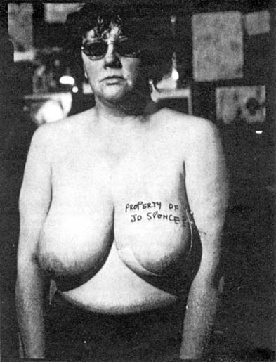
There are also Model Release forms, which is when an individual has the right to protect their own images and what they are used for. There will be certain specific details that are attached to their work that is an indication on what they will and wont allow to be done to or used, regarding their work. The general rule is to protect the persons work from offensive use and defamatory.


Wednesday 14 March 2012

Putting theory into practise

Putting theory into practise

Looking at Jo Spence

Many of her works were self portraits about her own fight with breast cancer.
The photograph of her, taken whilst having a mammography done, exemplifies her vulnerability, as semi-naked, she literally has to place her body under the control and scrutiny of this machine. When you look at her work it all has such a deeper meaning, it's not just nudist pictures it's telling a story and showing feelings and fears captured in a second, photo therapy is what it is called.


I love how she has captured herself with such emotion in every shot. They are meant to make you stop and thinking about what you are seeing. 


We then had to look at the intro page in any photography book and choose a sentence to relate to the photographer we had been given (Jo Spence).

I chose the sentence: 'Illusion is appropriate, for it recalls to us the extent to which the attempt to record and fix a permanent image was seen as almost magical in it's effect and suggestiveness'.

Then I brain stormed what 'Illusion' meant to me:
-Unique
-Tricks the mind and eyes
-A picture within a picture
-Strange
-Hallucinations 
-Something that's not really there
-In the corner of your eye

Now I had to relate this word to my photographer.

I think Jo Spence's work can be related to illusion because people think that they have the idea of illness and cancer in their mind, they think they know how people look and feel. Jo's images really speak her mind and takes the illusion of glamour and turns it into real-life, you really see how she is feeling from the photographs and what really goes on.
She ended up having a mastectomy and that as a woman is very degrading. She has photos of herself topless with dates on a bit of card from when she was in hospital leading up to it. This could be her trying to maintain her identity as a woman because I can only imagine what it would be like to lose something that makes you what you are, and then trying to continue being and feeling feminine. She is truly an inspiration. 


I love this picture. She has written on the breast she has/having removed. This is such a powerful image and message.


Tuesday 13 March 2012

Knife pictures


A glitch


Another idea I have is to have someone with a butter knife behind their back in the foreground and then in the background just out of focus on a table could be a slice of bread and a tube of butter. It would be quite funny coz it would be like someone is going to kill the bread or slice it up and butter it.


Interview research

I decided to look at interviews to help inspire me with my questions and get a feel for what kind of answers I might get.

I had a look at Nigella Lawson because she is one of my favourite TV Chefs:


These are the kind of questions I'm looking for. I have one or two of these in my line up which is cool but I will take in the information in this interview and involve it in my own interview.

I also have to look at food critique interviews because I am planning on doing one of these as well.

They are the kind of things I was thinking about, 'What's the worst and the best thing you have ever eaten, whilst being a food critique?' and then I will ask about the cook that I am interview and ask the food critique why he thinks her food is good, why it stands out.

Word doc.

In our next brief we have been given the task of creating, designing and photographing our own magazine. It can be any kind of magazine we want and has to have a minimum of 6 pages and feature an interview inside. E.g If I was doing a car magazine I could make up an interview with a car enthusiast or a racing driver.


Before I start looking at the magazine companies I could create a magazine for, I'm going to look at the types of magazine.

-Music
-Auto
-History
-Music
-Animal
-Lifestyle
-Sports
-Fashion
-Photography and Art
-Cooking and Food
-Women's
-Men's
-TV and Entertainment
-Home and Gardening
-Computers and Technology
-Teen


I have decided to create a food and kitchen magazine, because I am very interested in food and the way it can be photographed to look so appetising. It will include interviews from my mum as a chef and my dad as a food critique. A few main things that will also be included in the magazine are:

-An intro to the magazine from the designer and editor, me.
-A contents page
-Tips and tricks
-Front cover
-A few recipes
-Essentials for your kitchen

I had a look at a food magazine to see what the layout and designs were, and to give me ideas and tips:

This is the intro page, just a little bit about what is to come and about the editor.

This is the essentials page. Where the cooks and chefs give you tips on what is key to have when cooking, whether it pans or herbs.

These are some recipes that are included inside. They tell you what you need, how much, and how and when to cook it. There is also little cook’s notes sometimes, which give you helpful tricks and tips.

The contest page just tells you everything that is in the magazine and what page number it is on, which is very helpful if you are just wishing to look at one thing and want to find it quickly without flicking through the whole thing.

The front cover is the first thing you see before you start reading the magazine. It needs to be flashy and draw you in, make you want to read it. There are sometimes a few large headlines like, ’20 tips and tricks to help with the party season’ to get your attention.

The front cover is the first thing you see before you start reading the magazine. It needs to be flashy and draw you in, make you want to read it. There are sometimes a few large headlines like, ’20 tips and tricks to help with the party season’ to get your attention.

Kelsey Topping Interview 
Me: Hello Kelsey, thank you for coming.
Kel: It’s ok.
Me: Right, so first question. If you could change 3 things about yourself, what would they be?
Kel: My ‘Jelly Belly’, Forehead and Hairstyle.
Me: Really. Ok next question. Where is your dream place to live?
Kel: Australia.
Me: What did you do at the weekend?
Kel: Hung round at my boyfriends and did some babysitting.
Me: What is your favourite song?
Kel: Alligator sky, by Owl City.
Me: And last question, why so serious?
Kel: Coz I can.
Me: Thank you for your time.
Kel: Your welcome.

This is the kind of thing I will be doing, but with questions about food. I have started to think about the questions I will ask, here are a few of them:
-What is your favourite thing to cook or bake, and why?
-How long have you been cooking for, and have you always loved it?
-What is your favourite gadget to use in the kitchen, whilst you are cooking?
-Have you ever had a major food disaster?
-Where do you get your main inspiration for your recipes?


Monday 12 March 2012

My Magazine

Thinking about my layout of my magazine.


Looking at the making of
Something like, 'Home Cooking' or 'Tastes Like Home'.

I chose Home Cooking because I think the style of magazine I'm making is a 'homey' style guide.


I started out by making the front cover, using a template for a magazine and a photo of a cake my mum baked.


Then I started looking at titles and added leaves for an 'autumny'

Then I looked at barcodes.


And then added subheadings and information about what was in the magazine.


Then I decided to move the barcode to the other side because everything was on the same side.


I started adding different colours and effects to the fonts to make them stand out and look more professional.


Then I designed the back of the front cover:

Starting with the orange.

Then adding a bit of text explain what the readers could expect in this months issue.

Then I added a picture of someone decorating muffins.

And of course some leaves.

This is the final design.

Another page idea was for a Tips and Tricks for your kitchen. So I took some pictures of my kitchen to add for a background.

This picture could be used as a background, double, page spread.


These are for the tips bit. To make sure all equipment is stored away neatly but has easy access.

Cooling trays for baking.


This is the layout for the 'Tips and Tricks' page. I used a photo of my kitchen for a double page spread picture but I lowered the opacity so that I could put other pictures over the top and text and you would be able to see it better.

I also carried on the leaf theme, I think it will look quite cool if there is a bit all the way through the magazine.


I then decided that I would make all the other backgrounds to the other pages, orange with a yellow border. Just so that the magazine had a theme running through it, I am sticking with the autumn orange theme.

SO I made some copies of this simple design and used it on some of the pages.

I think I changes m mind about having the kitchen picture as a backdrop because A: You couldn't really add many more pictures without them blending in and B: I think it was just over powering and when I had added text I think it would have drawn the attention away from it and you wouldn't have been able to see it properly. 
The first design I did with this background was the recipe page.


This is the photo I am using for the recipe page.

This is for at the end of the recipe when you can decorate the cakes.

And this is the Head shot I am using for the Chef I am making up for the interview.

So before I added the pictures to the pages I edited them a little on Photoshop, just to get rid of the odd crumbs that were on the plate. I did this with the 'Spot Healing Tool'.
There is just a bit of orange peel on the plate in between the muffins that I didn't want there.


Then I used the 'Quick selection tool' highlighted the parts of this image I wanted to cut out.

Then I pasted it onto the orange background.

And re-arranged it to where I wanted it.

Then I was going to add another picture, but decided against it because there might not be enough room for the text and that is more important.

So I then started adding text.

Writing out the recipe.

I then added a small yellow circle, to make it stand out, to add some tips in.


Next I added the leafy pattern that I am incorporating into all the pages.

More leaves.

This is when I had cut it out of the main picture, I had to go around the whole thing and fade out the edges.

This is it highlighted, ready to be cut.

I first decided to just add the whole picture to the page but then thought that just the muffins on the plate with look a lot better and more professional. Also it looked out of place with the background still in the picture.

So this is the finished Recipe Page:

I really like how this turned out, I think it turned out better then I thought it would. I really like the layout, I think it is very clean and to the point and looks quite professional. I decided to add a the little touch of changing the font for the name 'Lisa Lou' so that it looks like she has sighed it. 

Then I redid the Tips and Tricks page:


I then started on the competition page:


Then the Interview page:


The Tips and Tricks page.
I decided to merge this page with the competition page because I thought that they looked so much better side by side.


This is the page before I merged it.


I decided it would be cool to add snowflakes and winter colours since it is a competition for Christmas


These are all the final pages, in order.

I love the front cover, I really like how the photo looks 'homey'. It gives a sense of home food and home cooking, which is what the magazine is about.

This is my favourite page. I love the layout and how the orange on the cakes matches the orange on the page.


I think this worked out ok, I like the layout.