Thinking about my layout of my magazine.
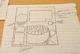


Looking at the making of
Something like, 'Home Cooking' or 'Tastes Like Home'.
I chose Home Cooking because I think the style of magazine I'm making is a 'homey' style guide.


These are all the final pages, in order.


Looking at the making of
Something like, 'Home Cooking' or 'Tastes Like Home'.
I chose Home Cooking because I think the style of magazine I'm making is a 'homey' style guide.

I started out by making the front cover, using a template for a magazine and a photo of a cake my mum baked.


Then I started looking at titles and added leaves for an 'autumny'

Then I looked at barcodes.


And then added subheadings and information about what was in the magazine.


Then I decided to move the barcode to the other side because everything was on the same side.


I started adding different colours and effects to the fonts to make them stand out and look more professional.


Then I designed the back of the front cover:

Starting with the orange.

Then adding a bit of text explain what the readers could expect in this months issue.

Then I added a picture of someone decorating muffins.

And of course some leaves.

This is the final design.
Another page idea was for a Tips and Tricks for your kitchen. So I took some pictures of my kitchen to add for a background.

This picture could be used as a background, double, page spread.


These are for the tips bit. To make sure all equipment is stored away neatly but has easy access.

Cooling trays for baking.

This is the layout for the 'Tips and Tricks' page. I used a photo of my kitchen for a double page spread picture but I lowered the opacity so that I could put other pictures over the top and text and you would be able to see it better.

I also carried on the leaf theme, I think it will look quite cool if there is a bit all the way through the magazine.
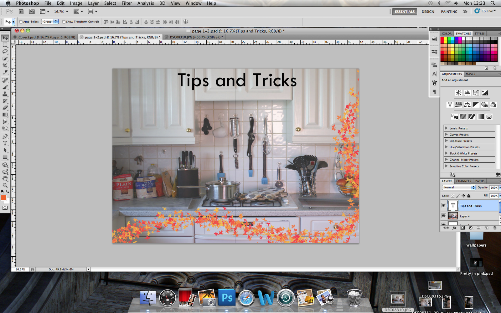


I then decided that I would make all the other backgrounds to the other pages, orange with a yellow border. Just so that the magazine had a theme running through it, I am sticking with the autumn orange theme.
SO I made some copies of this simple design and used it on some of the pages.

I think I changes m mind about having the kitchen picture as a backdrop because A: You couldn't really add many more pictures without them blending in and B: I think it was just over powering and when I had added text I think it would have drawn the attention away from it and you wouldn't have been able to see it properly.
The first design I did with this background was the recipe page.

This is the photo I am using for the recipe page.

This is for at the end of the recipe when you can decorate the cakes.

And this is the Head shot I am using for the Chef I am making up for the interview.
So before I added the pictures to the pages I edited them a little on Photoshop, just to get rid of the odd crumbs that were on the plate. I did this with the 'Spot Healing Tool'.
There is just a bit of orange peel on the plate in between the muffins that I didn't want there.


Then I used the 'Quick selection tool' highlighted the parts of this image I wanted to cut out.

Then I pasted it onto the orange background.

And re-arranged it to where I wanted it.

Then I was going to add another picture, but decided against it because there might not be enough room for the text and that is more important.

So I then started adding text.
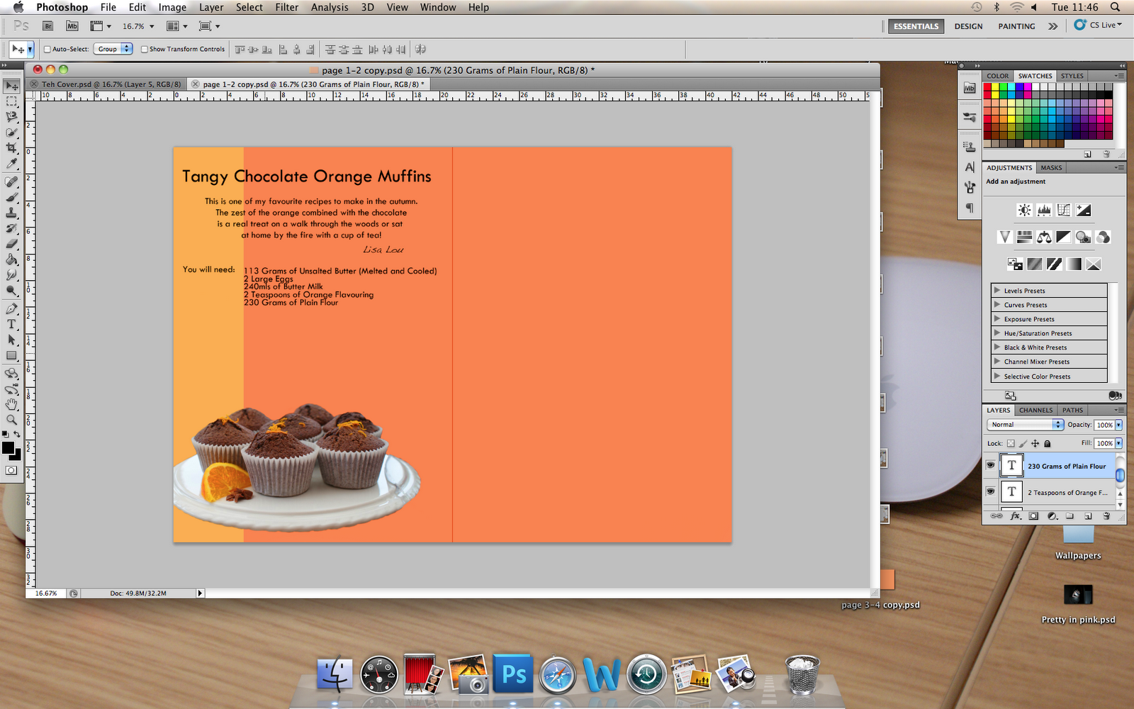
Writing out the recipe.

I then added a small yellow circle, to make it stand out, to add some tips in.


Next I added the leafy pattern that I am incorporating into all the pages.
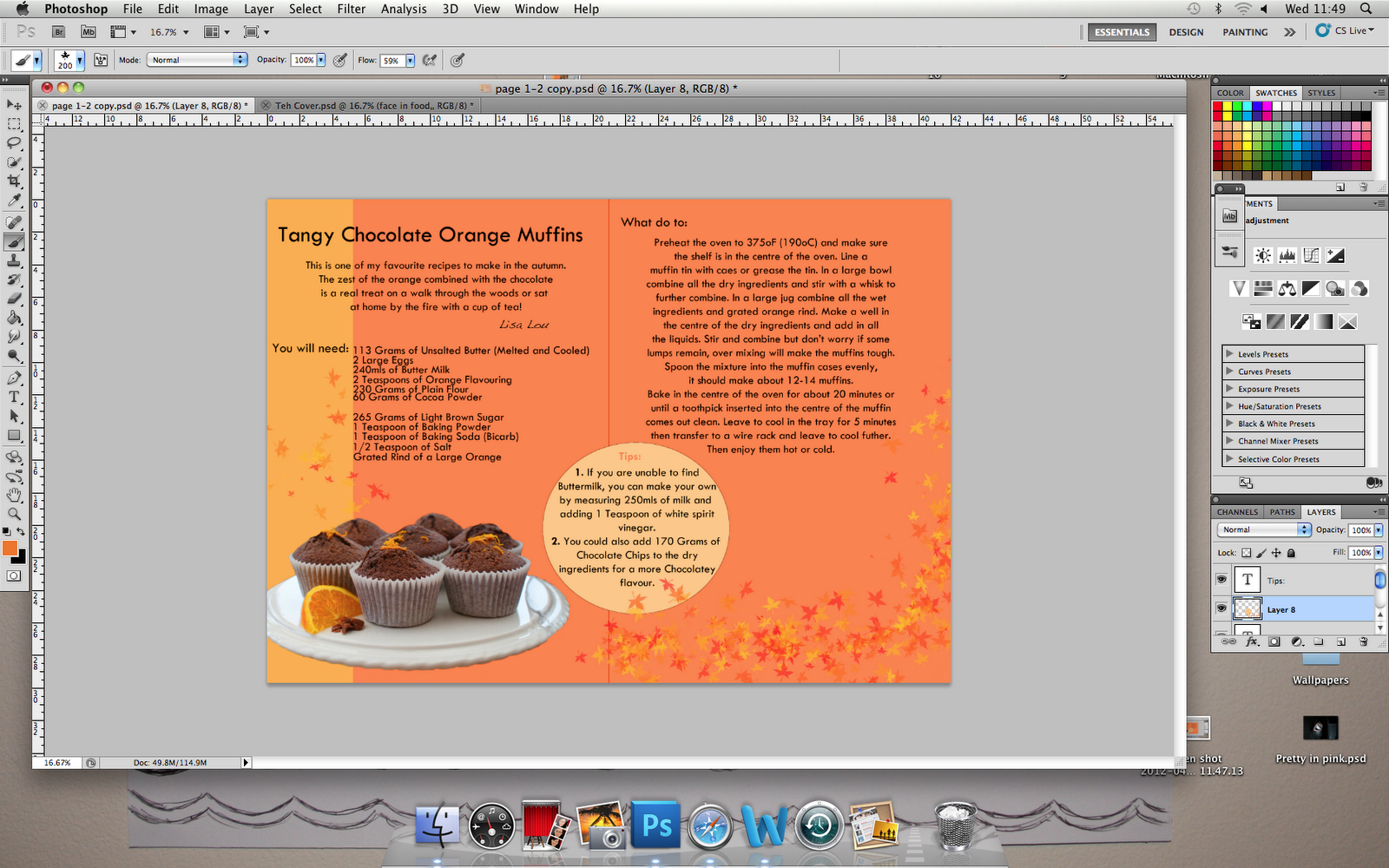
More leaves.

This is when I had cut it out of the main picture, I had to go around the whole thing and fade out the edges.

This is it highlighted, ready to be cut.

I first decided to just add the whole picture to the page but then thought that just the muffins on the plate with look a lot better and more professional. Also it looked out of place with the background still in the picture.
So this is the finished Recipe Page:

I really like how this turned out, I think it turned out better then I thought it would. I really like the layout, I think it is very clean and to the point and looks quite professional. I decided to add a the little touch of changing the font for the name 'Lisa Lou' so that it looks like she has sighed it.
Then I redid the Tips and Tricks page:

I then started on the competition page:

Then the Interview page:

The Tips and Tricks page.
I decided to merge this page with the competition page because I thought that they looked so much better side by side.


This is the page before I merged it.

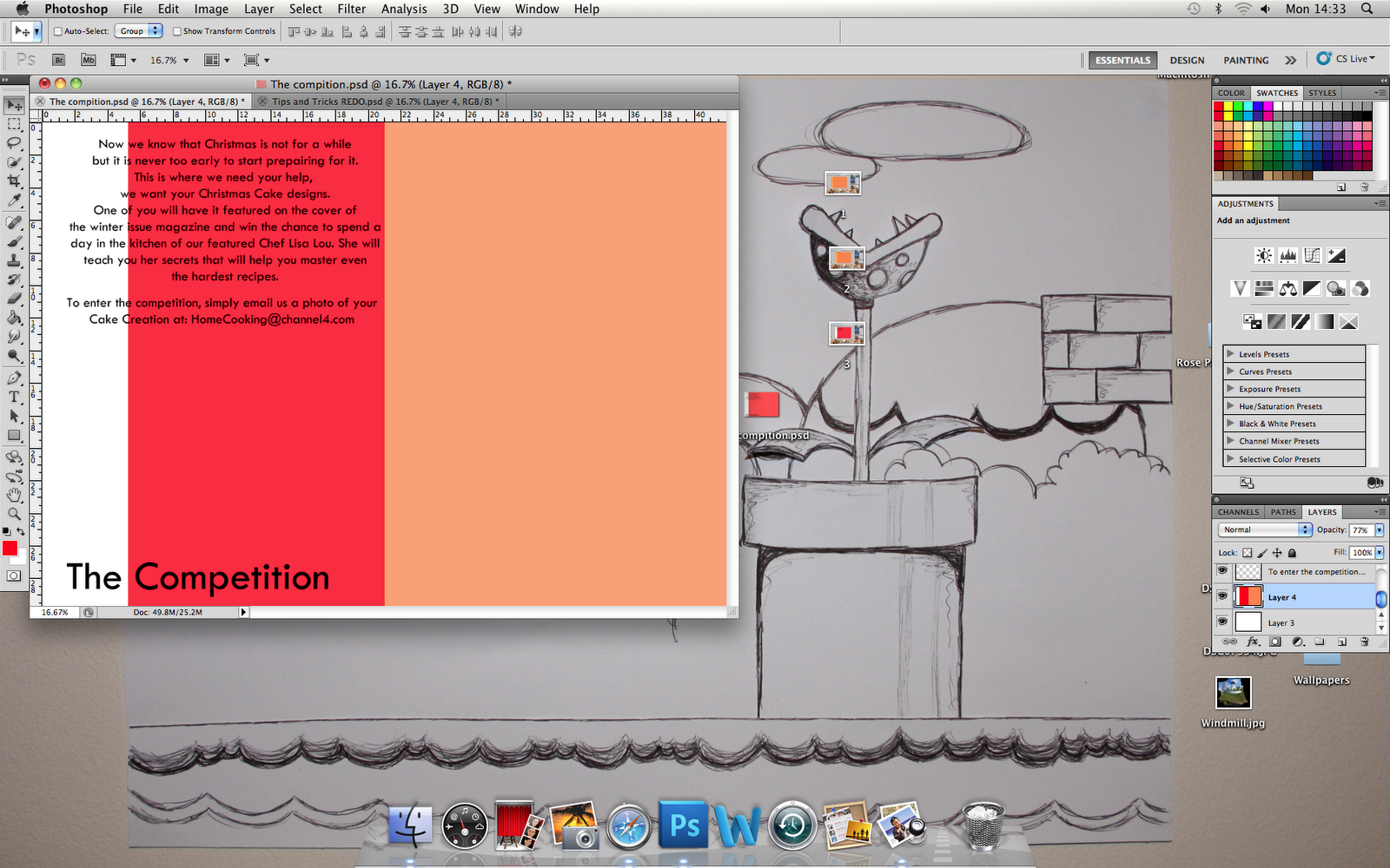
I decided it would be cool to add snowflakes and winter colours since it is a competition for Christmas

These are all the final pages, in order.

I love the front cover, I really like how the photo looks 'homey'. It gives a sense of home food and home cooking, which is what the magazine is about.

This is my favourite page. I love the layout and how the orange on the cakes matches the orange on the page.

I think this worked out ok, I like the layout.

No comments:
Post a Comment